Rebranding any company, at any level, requires planning, collaboration and sensitivity. But when you’re a world-leading brand in your sector, it’s even more important to take a holistic view of the project to ensure you get it right. You don’t want to end up spending a bucket load of dollars and hours of precious time for the rebrand to be a flop in the market.
A Whopper of a Rebrand
So, back in 2020, when Fernando Machado, the CMO of Burger King, was leading the rebrand of the fast-food chain, he and the team needed to take extra care with such a valuable and globally recognized asset. Fernando had to think about not only the now, but also the next. The team wanted to leave a legacy that would last for the future custodians of the brand. As Fernando quite rightly acknowledged:
"You’re only the guardian of your brand for a while.”
Brand Identity
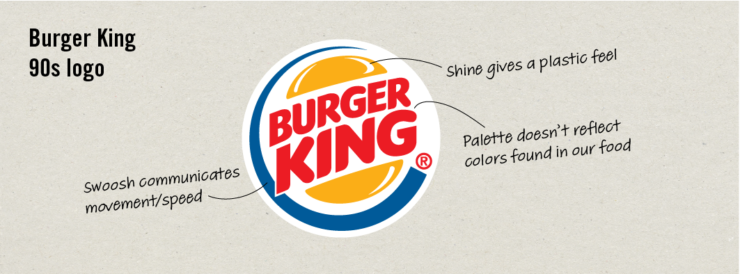
The existing brand was trend-led, and although it worked in the 90s when it was developed, it had elements that were now working against the modern-day messaging, that is, real food tastes better. For example, the original logo had a shine, which made the bun look plastic. Not a great look for a brand advocating the use of no artificial sources in its food!
In response, Burger King looked to create a new logo as part of the rebrand that was both modern and classic — this was seen as pivotal to designing a timeless brand identity. Modern and classic? Sounds a bit like an oxymoron, you say. Well, it does, but you can have both, and the key is going back to the future.
No need to fire up the DeLorean for this one. A look through the archives will do just fine.
Brand Heritage
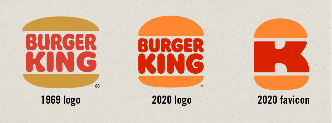
The first step is truly understanding your brand heritage. The BK team went back through the history of their visual identity and discovered that the classic and instantly recognizable burger logo, which was used for 30 years between 1969 and 1999, was BK at its best — timeless. In fact, it could be picked up and used there and then, without question. This classic concept would become the inspiration for the team’s work.
The original logo was tweaked slightly to give it a more modern flavor, and to allow a suite of digital and physical assets to be created around it. This included the favicon — an asset that received much love in the design world.
Fernando summed up how important understanding brand heritage was to the final result...
“The brand work is all new, but it seems familiar. It feels like the way Burger King should be.”
More Than Just HeritageOf course, there are many more steps to undertaking a rebrand, but truly understanding your brand heritage is a great place to start. You can watch how Fernando and the team rebranded Burger King as the key stakeholders go step-by-step through the process from concept to global rollout in our course,
Creative Branding with Fernando Machado.
Happy rebranding!
- Stu